Petition to have a vomit ![]() reaction just to this
reaction just to this
5 Likes
Trying to illustrate sensory overload?
2 Likes
Succeeded in illustrating sensory overload. My head just popped and I’m now going to a darkened room to try and regulate myself.
3 Likes
I’ve put my tinted ballistic goggles on locked myself in the armoury until I recover
I’ve taken 2 tabs of acid so I can return to reality
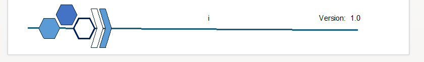
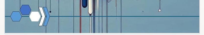
And implementation of the Footer Graphic. . .
ACP 7010 has it horizontal on the frontpage . . .

But then its wonky on every other page, also looking like it’s just been copied and pasted into the footer rather than actually being part of the document design.
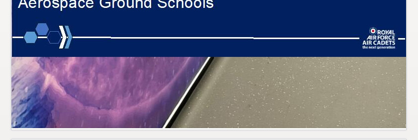
ACP 7011 has it on the front page
but then doesn’t have it on any other page.
ACP 3014 has it as part of the title section on the front page
Then nothing in the footer but a wonky line in the header
1 Like
What a mess.
Also, why are we suddenly using numbers in the 7000s?! I’m guessing there is a reason, but it’s not obvious.
1 Like
Not a Clue.
I actually quite like the overall refreshed design for policy documents (although the AI Images can go in the bin, just use a nice quality image relevant to that policy area) but the implementation needs to be standard across all documents and the Policy Maturity Level meter needs to actually be updated as policy matures.
3 Likes
What has been seen cannot be unseen. And that wonkiness has given me rage.
2 Likes
So does this refer to how mature you need to be to understand the policy? Or how mature the policy is in terms of development?
Like, if the former, something like ACP 1358 would be low as it should be really understandable by all. But a policy that outlined running overseas expeds would be high. This is what I thought the bar meant before seeing your post!
If it’s what you say, a bar is silly. Should just be a list. Concept, draft, approved policy, needs updating, outdated. Or similar.
I think the RAF has (or had) policy for training, which was the AP 7000 series. I assume HQAC training are using the same.
1 Like
I hadn’t even considered that it could be this, In my mind a Red to Green colour scale would be inappropriate for that and instead a statement
This policy meets UK Government writing standards and is suitable for Cadet audiences
or
This policy meets UK Government writing standards and is suitable for SME audiences
etcetera
Yeah actually, AP 7000: Through-Life Generic Professional Military Development
1 Like
Classic RAFAC move this. We’ve both read the exact same thing and interpreted it completely differently. And having now heard both I’m honestly not sure which is more accurate. If it’s either, I think the bar style is a trouble way of getting that bit off information across!
Good to know that this is where all of the very limited funding has gone.
2 Likes
I think it’s just someone playing with copilot. I can get pretty similar style looking images very quickly with simple prompts:
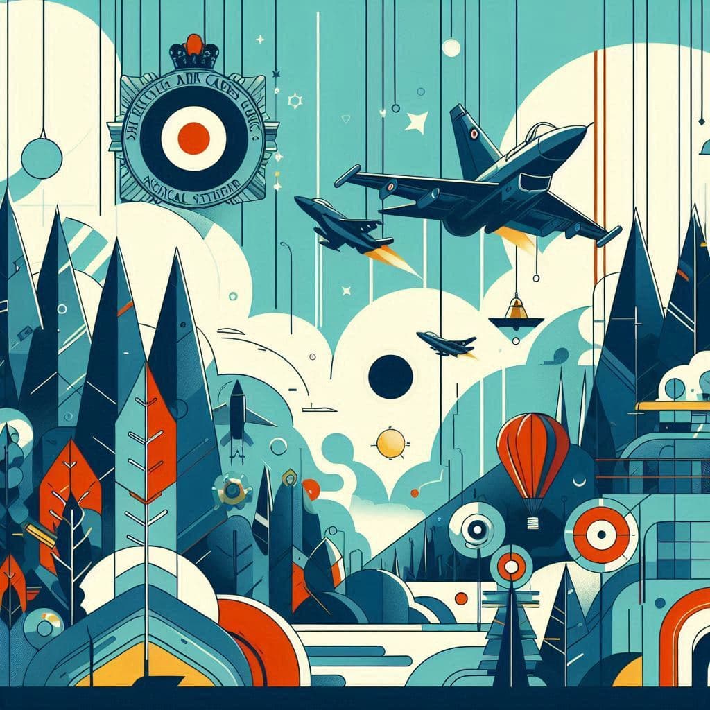
2 Likes
Just because you can, doesn’t mean you should ![]()
2 Likes
Wow, that looks horrendous. Can’t believe someone signed off on these going out like that
Can someone explain why CoPilot can’t seem to manage text in images? Someone at work was getting it to make new company logos for the lols and the text was horrendous. Either messy/unreadable or awful spelling (even though it was all words that had been included in the query).
I think because it doesn’t see the text as text. As with the other images/patterns/colours, it’s just making it up.
2 Likes