Does anyone know whether there are certain rules hidden somewhere about how squadron crests should be?
We are thinking of re-designing ours and we would like some advice. Also, how would you advise us going around getting it designed? A graphics designer perhaps or paint ha ha?
[quote=“Baldrick” post=16785]If there are rules, they are widely ignored.
PM me your email address and I’ll dig out my high resolution blank crests. I edit all of mine on Photoshop.[/quote]
There is actually a badge template here in the Resources section. It is an Adobe Illustrator format, so it may not be as easy to update as a large, blank outline but it will create a scalable, vector copy of the badge.
Also - minor pet peeve: the whole sqn no goes in each of the inserts, so if you’re 1234 Sqn you should have 1234 on both sides - not 12 on one side and 34 on the other.
[quote=“incubus” post=16949][quote=“Baldrick” post=16948]This is what you need.
(A larger version can be emailed.)[/quote]
Well, except for the odd gold effect and the white text![/quote]
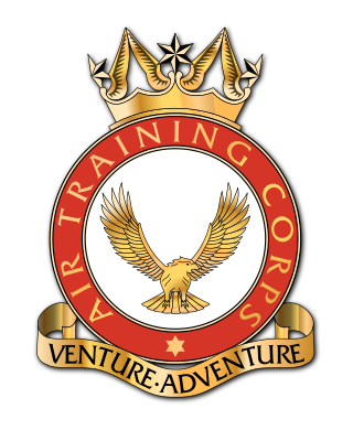
The Corps one is gold.
I’ll admit the issues with the font but that is easily changeable, it should be the same colour as the outside (gold or yellow) for the lettering inside the circle and black for the mottos.
Attached is the logo from the Corps CD they issued to each squadron over a decade ago.
The “gold” is a flat colour and not a metallic gradient. Their typefaces are scruffy too.
[attachment=152]ATC.jpg[/attachment]
I can produce both types. I also think I have somewhere the font as in the one you just produced, but no idea where I got it from. I went for Times New Roman so that anyone could edit it and it would look the same.
[quote=“wdimagineer2b” post=4638]Personally, I detest Times New Roman. It’s just such a boring typeface.
I’ve always used Flareserif 821 as a nice, close alternative to the hand drawn type of the original ATC badge.