worse than the fallic falcon?
2 Likes
Haha more than anything else I remember the meme pages about it…
They don’t have quite the same effect now I’m a CFAV and find the daft nonsense that keeps happening to be meme’d about just sad rather than amusing
It’s a clever idea and would work really well if our wings were numbered instead of named. You could then standardise that second colour for each numbered wing.
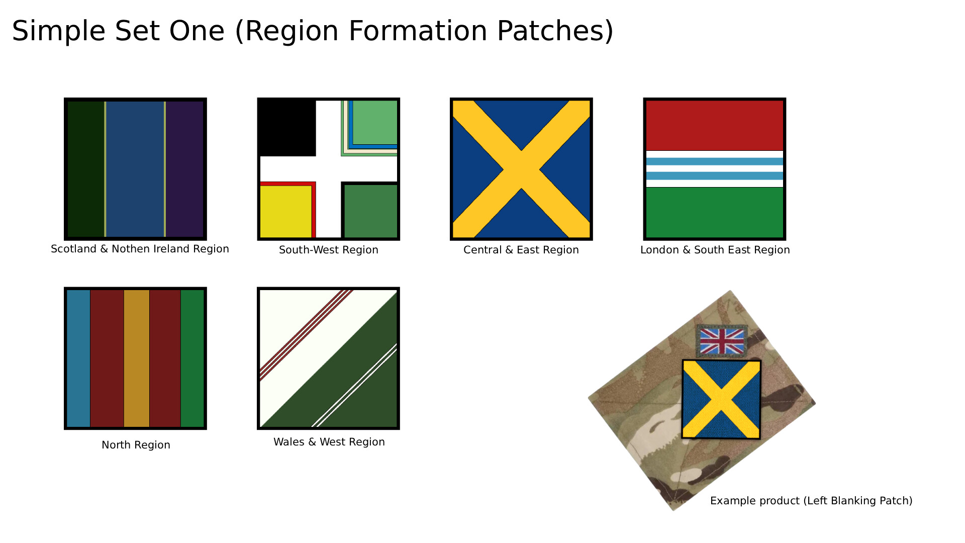
Here’s a very rough idea of something I’d been cooking up as an alternative proposal to using the full badges (because there’s no halfway house, but it felt a shame not to milk them for all we could).
The idea was essentially to crudely pixelate the heraldic badge centrepiece, so if you knew what they looked like, you could guess the formation patch.
Some look better than others and this is only a very rough creation on my phone because I saw this was being discussed.
You could standardise the partitions as a 3x3 grid or leave it more free. Sometimes it works well. Other times less so.
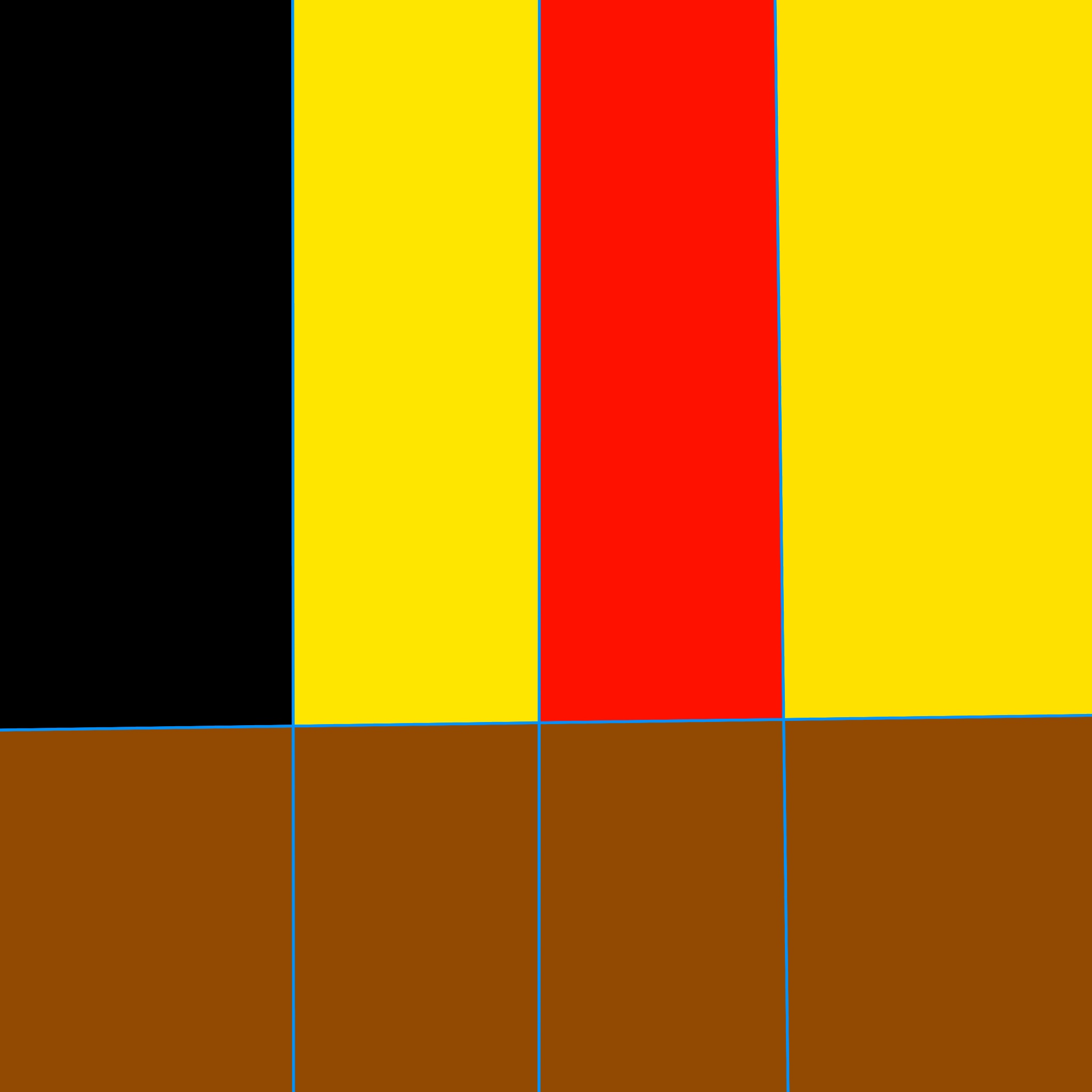
Two of these are the authorised region badges. One of these is an unauthorised badge I hope to basically preserve. Test the theory and see if you can tell (you don’t have to like them ![]() ).
).
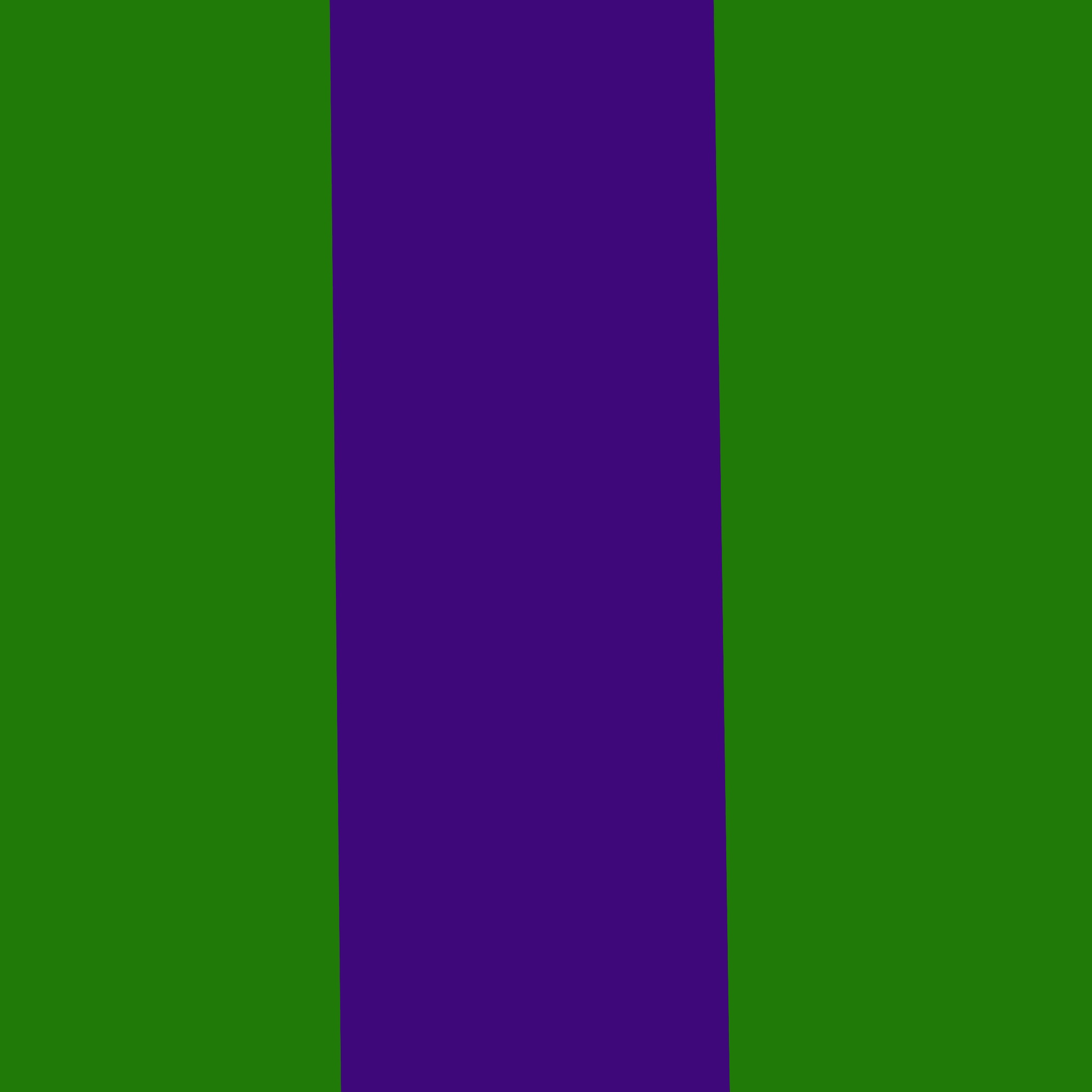
I can immediately see the bottom one is C&E and I’m guessing the top one is SNI, because of the purple (from the thistle?)
As for the middle one? I know W&W is the only other authorised badge: but that’s cheating.
I think middle is Durham & Northumberland wing.
Can’t see the C& E link though.
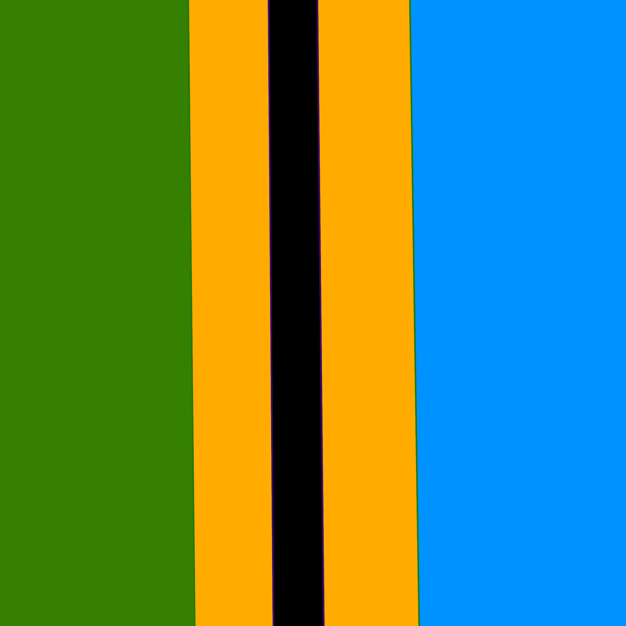
Central and East Region is tough because the right side has blue and white waves and you don’t want them too noisey.
The rough idea there was background split between the green and blue/white halves of the roundel, then a strip of black for the Viking helmet flanked by two strips of gold for the golden wings protruding from the helmet.
It’s a real shame using the centrepiece in a circular red border wasn’t permissible.
The central & east one looks more Scottish but i do like the idea of diagonal stripes/bands which definitely distinguishes ours from regulars.
1 Like
I think the yellow saltire is St Alban rather than St Andrew, but St Albans would be in SWR wouldn’t it?
Hertfordshire so either C&E or Laser
1 Like
I quite like the look of it.
You’d potentially then have the background colour as the region, and the cross as the wing.
1 Like
It’s the mercia flag ![]()
![]()
2 Likes
With how rafac is I don’t ever think we would have wing patches for multiple reasons.
No1. It would be far to expensive
No2. Rafac is moving away from wings and going more region based
No3. It would be a pain to send out to each wing and it would also mean more money on design cost
1 Like
Region patches would make more sense financially but it’s rafac so you never know
Ah that makes sense.
Historicaly always classed Mercia as wales & west rather than east. ![]()
1 Like
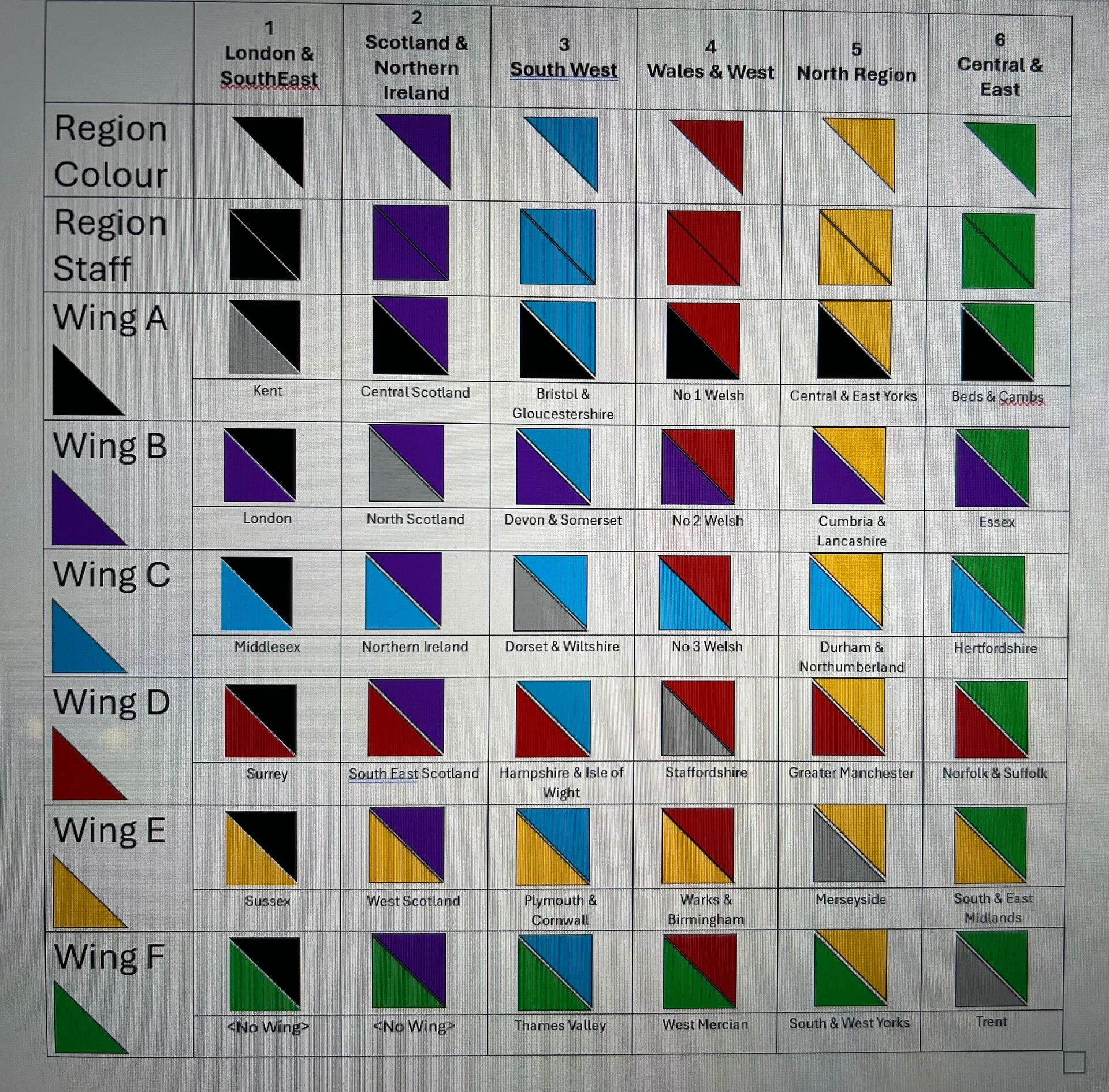
So I think my numbers confused it - it was more for a grid reference in a reference table to enable quick recognition.
I’ve done a final tweaked grid. Region numbers are those that match the SATT numbers. Tried to link colour to current region logo but again more to demonstrate rather than specific.
I really like the cross idea as I think it looks good & I only picked the triangles for simplicity. However the big advantage of the triangles is that you have less unique badges (as you can use some upside down) which makes it cheaper.
Suppose you could just order the triangles & ask everyone to composite but not sure how that would look in reality.
I suppose the only issue is that they’re so similar in form that you’d need a crib to understand it.
The ACF have a red square patch (worn at an angle, with the points at 12, 3, 6, and 9 o’clock) with the ACF badge in it.
Despite being smaller than my proposals, they’re still clear and it’s obvious what they are.
The CCF also have the purple one with their badge. Again, nice and clear what it is.
1 Like
I think in reality you would learn your region colour & your wing colour and then maybe the colours of the regions.
The wing order is alphabetical so if you need to on the fly you could work it out but in general you would only be using the badges to group your region & your wing.
Re the CCF & ACF badges they are the equivalent of the RAFAC badge we wear on the right.
Purple is for adults & in theory the cadets wear the CCF logo with service colour background (so red, dark blue, light blue) but RN don’t really wear MTP & RAF are made to conform with the ATC.
I see that you discovered a flaw with using a wing colour the same as the region colour.
At least Thames Valley can make use of any leftover JL DZ.
2 Likes
Talking of which, would these just fall by the wayside in this proposition?
Also would it be proposed for CCFs to use the flashes too?