It has certainly been useful to stimulating ideas and occasionally creating an isolated element to help me sketch initial design concepts.
But yeh, unfortunately it’s an absolute dumpster fire and even if you provide clear examples which indicate the frame remains the same, it just seems unable to handle it and defaults to some generic heraldic monstrosity
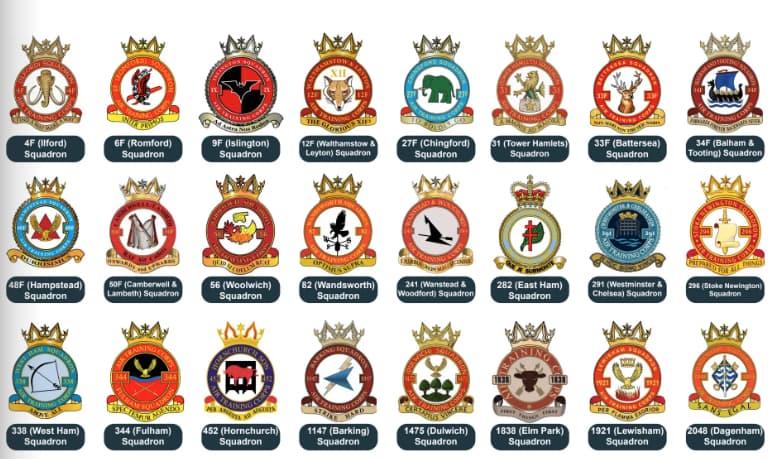
So London Wing have just released a very good looking Annual Report, hats off to their media team.
Unfortunately you can see the lack of clear identify here, before looking that those with the wrong colour rings it’s the number of different shades of red that offends me first!
I think it’s template on acc drive that’s caused that - I know it’s now a bit orange rather red. Could do with the Pantone reference for the colours. You can tell the ones you tried to comply on the last push as it’s all the same shade of orange.
What the bonus is that it effectively names & shames without naming & shaming
Ones that obviously need to change can be focused on & if each wing could do say as a draft for a corporate poster for the ATCs 90th anniversary you would probably get a quick compliance.
The thing that stands out most to be here is the overuse of a fully coloured background. Then the random ring colours.
But this really does highlight why some sort of guidance is needed to get people up to scratch. Even if not spending the money, but to get things to at least start to look similar.