They’re kind of apples and oranges though.
The stop on car parking removed indemnity cover for the activity, so it’s a safety issue, wearing your old squadron polo isn’t.
Not really the same thing, banning car parking means if you go ahead anyway you aren’t covered.
It’s more like the ban on non-regulation uniform accouterments (flight flashes or white belts for the duty NCO etc), which despite a long campaign by the WWO’s are still widespread. (Or like work banning the thin blue line patches which has been completely ignored by the frontline).
Yep, you’ve got me there.
I think that’s spot on The majority of Sqn badges are pretty good to be honest, approved or not.Getting a complete listing of all of them including their backgound would be a good start. There are a small minority that are awfull. The current branding policy is wrong in my book.
I’m sorry, but the majority are not good.
Anecdotal, but pretty much every unauthorised badge I see doesn’t even meet what many here have tried to define as “compliant” in their defence.
And there’s absolutely no graphical consistency, so you hold them next to each other and it looks chippy.
Most of this is done simply because the process isn’t understood and I mean no ill comment to those who’ve clearly put work in, but it really does need to stop.
People have sent me loads they’ve papped in the wild recently and it just looks unprofessional. Much as it’d look unprofessional to start colouring in the roundel and core logo however you wanted, or tweaking the font.
This isn’t the local crèche. We’re representing the parent service.
And people can’t say it doesn’t matter, because people all over the organisation clearly want to have a badge and engage in the principle of having a legitimate unit identity.
Insisting it is done properly really isn’t radical.
I think the majority are hanging and borderline brand damaging.
I think teams (I.e. not regions, wings or sqns) should perhaps have the logo without the crown.
Significantly similar but significantly different.
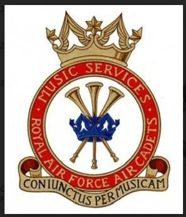
HQAC Music services have their own approved badge. It looks pretty good!
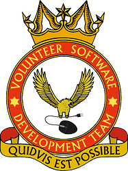
I have no real issue with a HQAC team using the Falcon personally, and the crest without indents is appropriate.
But isn’t that motto in two languages?
I think it should have been: quidvis est possibilis but I only added what I was told ![]()
I do wonder with crests badges like this whether we should still have reference to the central formation. So RAFAC VSDT, as there may well be another formation that also has a volunteer software team, or a music services team. For example, our music services does refer back to RAFAC:

Shouldn’t the “est” have gone at the end?
“quidvis possibilis est”
Doesn’t that one break the “rules” because it re-uses the crown in the centre?

No. That’s not a thing. Please don’t make it worse by randomly inventing more stuff.
Also, they’re not called crests.
Crests are something else very specific.
The military have badges.
Another Query: Can a RAFAC unit use an ATC crest?
Or to put it differently, does the ‘RAFAC’ even exist in heraldry?
Or to put it differently, does the ‘RAFAC’ even exist in heraldry?
As the warrant is the ATC & not RAFAC I would say not.
The CCF are a Warrent formation as is the AtC but not RAFAC which an administration part of the RAF.
No. That’s not a thing.
That was my thought process it’s just a logo that can be used as local branding by the Sqn / Sqn charity in its own right. It’s just a red ring with a scroll so not healdric.

